Verwenden Sie Matplotlib, Pandas und nutzen Sie Pythons Macht der Datenvisualisierung.
Run this notebook in your web browser: 
Der Link öffnet b07-pyplot.py als interaktives marimo Notebook, das vollständig in Ihrem Webbrowser läuft, ohne etwas zu installieren.
Warten Sie einen Moment, bis Python im Browser geladen ist (das dauert nur am ersten Start länger).
Klicken Sie auf die gelbe Starttaste (▶, unten rechts) um alle Zellen auszuführen.
Bearbeiten und re-run jede Codezelle zu experimentieren: marimo automatisch aktualisiert alle Zellen, die davon abhängig sind.
Ihre Bearbeitungen bleiben nur im Browser-Tab. Um sie zu halten, speichern Sie das Notizbuch durch das Menü (≠, oben rechts) > Export... > Python.
Run this marimo notebook locally
Um b07-pyplot.py auf Ihrem eigenen Gerät zu betreiben, erhalten Sie es vom marimo
Repository:
git clone https://github.com/sschwindt/marimo-python-course.gitDie Kursumgebung erstellen und aktivieren:
conda env create -f environment.ymlundconda activate hy-marimoStarten Sie im Ordner Repository das Notebook mit
marimo edit b07-pyplot.py
Run this notebook with Jupyter
This page is also available as the Jupyter notebook b07-pyplot.ipynb in the jupyter , or install Python and JupyterLab locally to run b07-pyplot.ipynb on your own machine.
Werkzeuge (Verpackungen) für Python¶
Mehrere Pakete ermöglichen das Ploten in Python. Auf der letzten Seite wurden bereits NumPy und pandas zum Ploten von Histogrammen vorgestellt. pandas Plot-Kapazitäten gehen weit über das bloße Ploten von Histogrammen hinaus und beruhen auf der mächtigen matplotlib-Bibliothek]. *SciPys matplotlib ist die beliebteste Plot-Bibliothek in Python (seit ihrer Einführung im Jahr 2003) und nicht nur pandas, sondern auch andere Bibliotheken (zum Beispiel die Abstraktionsschicht Seaborn]) verwenden matplotlib mit erleichterten Befehlen. Diese Seite stellt die folgenden Pakete zur Datenvisualisierung vor:
matplotlib - die Basis für die Datenvisualisierung in Python
pandas - als Wrapper-API von matplotlib, mit vielen vereinfachten Optionen für sinnvolle Plots
plotly - für interaktive Plots, in denen Benutzer Handlungsskalen ändern und verschieben können
Watch this section as a video
Watch this section as a video on the @Hydro-Morphodynamics channel on YouTube.
Matplotlib¶
Aufgrund seiner Komplexität und der Tatsache, dass alle wichtigen Funktionen mit pandas viel überschaubarer genutzt werden können, werden wir hier nur kurz auf matplotlib eingehen. Es ist jedoch wichtig zu wissen, wie *matplotlib * funktioniert, um die Basislinie des Plots mit * Python * besser zu verstehen und bei Bedarf komplexere Grafiken oder mehr Plot-Optionen zu verwenden.
In 2003, the development of matplotlib was initiated in the field of neurobiology by John D. Hunter (†) to emulate The MathWorks’ MATLAB® software. This early development constituted the pylab package, which is deprecated today for its bad practice of overwriting Python (in particular NumPy) plot() and array() methods/objects. Today, it is recommended to use:
import matplotlib.pyplot as pltEinige Begriffe und Definitionen¶
A plt.figure can be thought of as a box containing one or more axes, which represent the actual plots. Within the axes, there are smaller objects in the hierarchy such as markers, lines, legends, and text fields. Almost every element of a plot is a manipulable attribute and the most important attributes are shown in the following figure. More attributes can be found in the showcases of matplotlib.org.
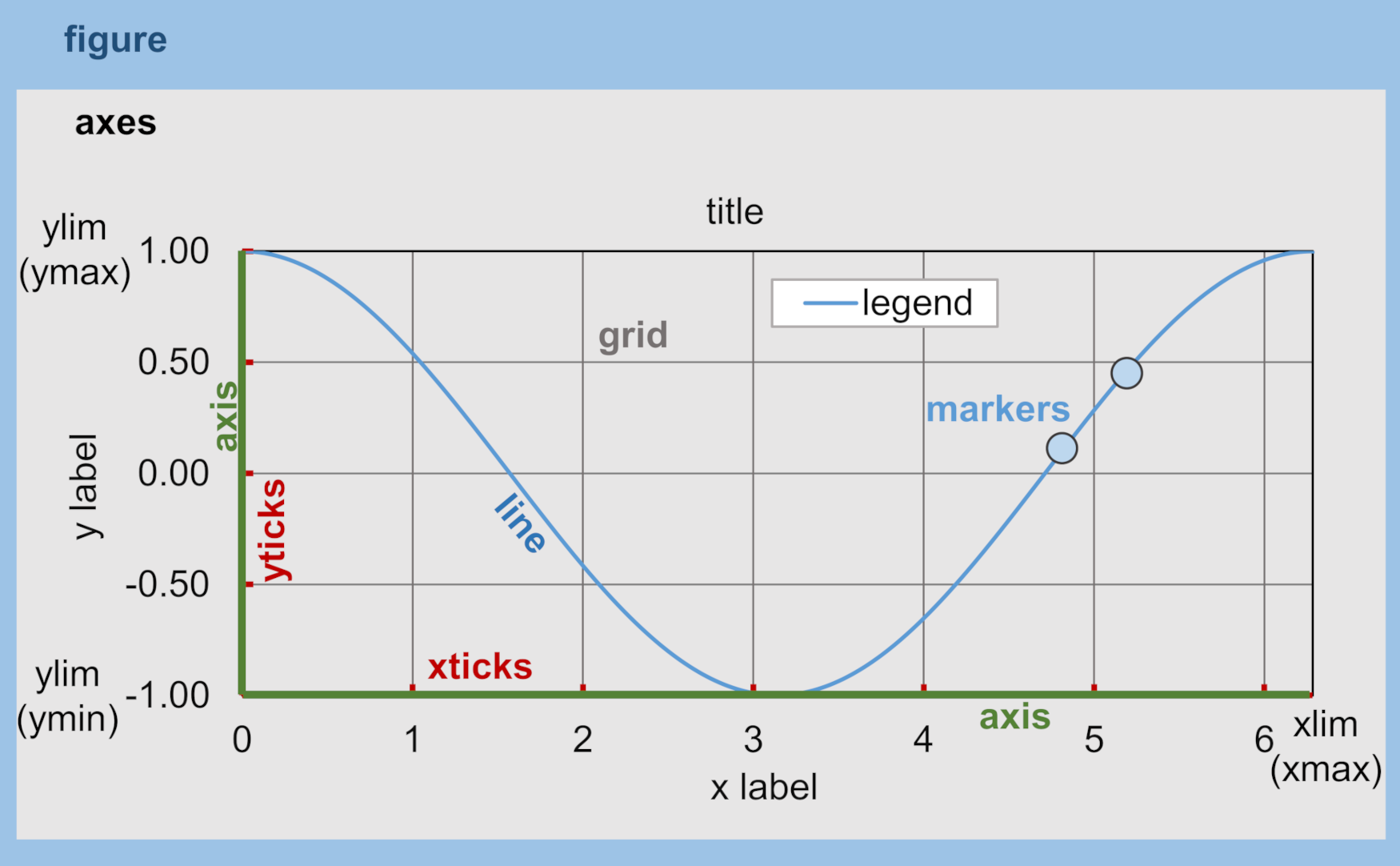
Figure 1:Elemente einer matplotlib.pyplot.figure.
Schritt für Schritt Rezept für 1d/2d (Linie) Plots¶
Importieren Sie Matplotlibs Plot-Schnittstelle mit
import matplotlib.pyplot as plt.Create a figure with
fig = plt.figure(figsize=(width, height), dpi=dpi).Add an Axes with
ax = fig.add_subplot(nrows, ncols, index, label=label); for example,ax = fig.add_subplot(1, 1, 1).Obtain a colormap with
cmap = matplotlib.colormaps["plasma"]and sample it with a normalized value such ascmap(0.5).Draw lines with
ax.plot(x, y, linestyle="-", marker="o", color=cmap(0.5))or points withax.scatter(x, y, marker="x", color=colors).Zecken für Manipulierachsen
plt.xticks(list)`  # define x-axis ticks
plt.yticks(list)`  # define y-axis ticks
axes.set_xlim(tuple(min, max))`  # sets the x-axis minimum and maximum
axes.set_ylim(tuple(min, max))`  # sets the y-axis minimum and maximum
axes.set_xlabel(str)`  # sets the x-axis label
axes.set_ylabel(str)`  # sets the y-axis label
Add a legend (optionally) with
axes.legend(loc=str, facecolor=str, edgecolor=str, framealpha=float_between_0_and_1)and many more**kwargscan be defined (see matplotlib docs).Optional: Save the figure with
plt.savefig(fname=str, dpi=int)with many more**kwargsavailable (see matplotlib docs).
Der folgende Codeblock illustriert ein Plot-Rezept mit zufällig gezeichneten Samples von einem *Weibull * distribution mit dem Verteilungsformfaktor (für a=1 reduziert sich die Weibull-Verteilung auf eine exponentielle Verteilung). Das Argument seed beschreibt die Quelle der Zufälligkeit und seed=None lässt Python Zufälligkeit aus Betriebssystemvariablen verwenden.
The below code block makes use of a function called plot_xy that requires x and y arguments and accepts the following optional keyword arguments:
plot_type=strdefiniert, ob ein Linien- oder Streuplot erzeugt werden soll,label=strsetzt die Legende,save=strdefines a path where the figure should be saved (the figure is not saved if nothing is provided). To activate saving a figure, use the optional keyword argumentsave, for example,save='C:/temp/weibull.png'saves the figure to a localtempfolder on a WindowsC:drive.
import numpy as np
import matplotlib.pyplot as plt
import matplotlib.cm as cm
x = np.arange(1, 100)
y = np.random.RandomState(seed=None).weibull(3., len(x))

def plot_xy(x, y, plot_type="line", label="Random Weibull", save=None):
  fig, ax = plt.subplots(figsize=(6.18, 3.82), dpi=100)
  colors = cm.plasma(np.linspace(0, 1, len(y)))

  if plot_type == "line":
	  artist = ax.plot(x, y, linestyle="-", marker="o", color=colors[0], label=label)
  elif plot_type == "scatter":
	  artist = ax.scatter(x, y, marker="x", color=colors, label=label)
  else:
	  raise ValueError("plot_type must be 'line' or 'scatter'")

  ax.set_xlim(0, 100)
  ax.set_ylim(0, 2)
  ax.set_xlabel("Linear x data")
  ax.set_ylabel(f"Scale of {label}")
  ax.legend(loc="upper right")
  if save is not None:
	  fig.savefig(save)
  plt.show()
  return fig, ax, artist


print("Plot lines")
plot_xy(x, y)
print("Scatter plot")
plot_xy(x, y, plot_type="scatter", label="Rand. Weibull scattered")
---------------------------------------------------------------------------
NameError Traceback (most recent call last)
Cell In[1], line 3
1 import matplotlib.pyplot as plt
2 import matplotlib.cm as cm
----> 3 x = np.arange(1, 100)
4 y = np.random.RandomState(seed=None).weibull(3., len(x))
6 def plot_xy(x, y, plot_type="line", label="Random Weibull", save=None):
NameError: name 'np' is not definedOberflächen- und Konturgrundstücke¶
matplotlib bietet mehrere Optionen, um X-Y-Z (2d/3d) Daten zu zeichnen, wie:
Surface plots with color shades:
axes.plot_surface(X, Y, Z)Contour plots:
axes.contour(X, Y, Z)Contour plots with filled surfaces:
axes.contourf(X, Y, Z)Surface plots with triangulated mesh:
axes.plot_trisurf(X, Y, Z)Three-dimensional scatter plots:
axes.scatter3D(X, Y, Z)Streamplots (e.g., of velocity vectors):
axes.streamplot(X, Y, U, V)Color-coded representation of gridded values with (annotated) heatmaps (e.g., for habitat suitability index maps):
axes.imshow(data, **kwargs)
Dieser Abschnitt zeigt die Verwendung von Streamplots, die ein nützliches Werkzeug für die Visualisierung von Geschwindigkeitsvektoren (Fließfeldern) in Flüssen sind (z. B. mit einem numerischen Modell erzeugt). Um ein Streamplot zu generieren:
Create an
X-Ygrid, for example with the NumPy’smgridmethod:Y, X = np.mgrid[range, range]Assign stream field data (can be artificially generated, for example, in the form of
UandVvariables in the below code block) to the grid nodes. Note that every grid node can only get assigned one scalar value, which isvelocity(as a function of the 2-directional field data) in the below code block.Generate figures, as before in the
plot_xyfunction example (see the above 1d/2d plot instructions).
Der folgende Codeblock veranschaulicht die Erzeugung eines Streamplots (angepasst von matplotlib docs]) und verwendet import matplotlib.gridspec, um die Teilplots in der Abbildung zu platzieren.
import matplotlib.pyplot as plt
import matplotlib.gridspec as gridspec

# generate grid
w = 100
Y, X = np.mgrid[-w:w:10j, -w:w:10j]  # imaginary step specifies the number of evenly spaced samples

# calculate U and V vector matrices on the grid
U = -2 - X**2 + Y
V = 0 + X - Y**2

fig = plt.figure(figsize=(6., 2.5), dpi=200)
fig_grid = gridspec.GridSpec(nrows=1, ncols=2)
velocity = np.sqrt(U**2 + V**2)  # calculate velocity vector

#  Varying line width along a streamline
axes1 = fig.add_subplot(fig_grid[0, 0])
axes1.streamplot(X, Y, U, V, density=0.6, color='b', linewidth=3*velocity/velocity.max())
axes1.set_title('Line width variation', fontfamily='Tahoma', fontsize=8, fontweight='bold')

# Varying color along a streamline
axes2 = fig.add_subplot(fig_grid[0, 1])
uv_stream = axes2.streamplot(X, Y, U, V, color=velocity, linewidth=2, cmap='Blues')
fig.colorbar(uv_stream.lines)
axes2.set_title('Color maps', fontfamily='Tahoma', fontsize=8, fontweight='bold')

plt.tight_layout()
plt.show()
Schriften und Stile¶
Das vorherige Beispiel zeigte eine Schrifttypanpassung für die Plot-Titel (axes.set_title('title', font ...)). Die Schriftart und ihre Eigenschaften (z. B. Größe, Gewicht, Stil oder Familie) können kohärenter mit matplotlib.rc definiert werden (siehe matplotlib docs](https://
import matplotlib.pyplot as plt
from matplotlib import rc

# set font preferences
rc(
  "font",
  family="Times New Roman",
  style="italic",
  weight="semibold",
  size=10,
)

# make some plot data
x_lin = np.linspace(0.0, 10.0, 1000)  # evenly spaced numbers over a specific interval (start, stop, number-of-elements)
y_osc = np.cos(5 * np.pi * x_lin) * np.exp(-x_lin)

# plot
fig, axes = plt.subplots(figsize=(6.18, 1.8), dpi=150)
axes.plot(x_lin, y_osc, label="Oscillations")
axes.legend()
axes.set_xlabel("Time (s)")
axes.set_ylabel("Oscillation (V)")
plt.tight_layout()
plt.show()
Instead of using rc, font characteristics can also be updated with matplotlib’s rcParams dictionary. In general, all font parameters can be accessed with rcParams along with many more parameters of plot layout options. The parametric options are stored in the matplotlibrc file and can be accessed with rcParams["matplotlibrc-parameter"]. Read more about modification options ("matplotlibrc-parameter") in the matplotlib docs. In order to modify a (font) style parameter use rcParams.update({parameter-name: parameter-value}) (which does not always work, for example, in jupyter).
In addition, many default plot styles are available through matplotlib.style with many style templates. The following example illustrates the application of rcParams and style variables to the previously generated x-y oscillation dataset.
from matplotlib import rcParams
from matplotlib import rcParamsDefault
from matplotlib import style
rcParams.update(rcParamsDefault)  # reset parameters in case you run this block multiple times
print("Some available serif fonts: " + ", ".join(rcParams['font.serif'][0:5]))
print("Some available sans-serif fonts: " + ", ".join(rcParams['font.sans-serif'][0:5]))
print("Some available monospace fonts: " + ", ".join(rcParams['font.monospace'][0:5]))
print("Some available fantasy fonts: " + ", ".join(rcParams['font.fantasy'][0:5]))

# change rcParams
rcParams.update({'font.fantasy': 'Impact'})  # has no effect here!

print("Some available styles: " + ", ".join(style.available[0:5]))
style.use('seaborn-v0_8-darkgrid')

# plot
fig, axes = plt.subplots(figsize=(6.18, 1.8), dpi=150)
axes.plot(x_lin, y_osc, label="Oscillations")
axes.legend()
axes.set_xlabel("Time (s)")
axes.set_ylabel("Oscillation (V)")
plt.tight_layout()
plt.show()
```{image} ../img/python/output_10_1.png
```Farben¶
Die Verwendung von Farbkarten ist ein heikles Thema: Oftmals zeichnen standardmäßig eingestellte Regenbogenpaletten unterschiedliche Farbtöne ab, die viele Zuschauer mit Farbsichtmängeln (ca. 1 von 12 Männern) nicht zuverlässig unterscheiden können. Betrachten Sie die folgenden Aspekte, um perzeptuell einheitliche, farbenblind-freundliche Colormaps aufzunehmen:
Sequentiell (niedrig > hoch): Verwenden Sie Matplotlibs
viridis,magma,plasma,inferno; oder domänenbewusste Sequenzen aus dem cmocean (siehe auch unten), um zum Beispielcmo.thermalfür Temperatur,cmo.halinefür Salzgehalt zu verwenden.Verschieden (Hervorhebung des Mittelpunkts): Verwenden Sie, wenn Werte um ein sinnvolles Zentrum (0, Klimatologie usw.) abweichen. Beispiele: Matplotlibs
seismic-Stil, aber wahrnehmungsmäßig abgestimmte Optionen wiecoolwarm(immer noch unvollkommen) oder cmoceansbalance,delta,curl, die für Symmetrie und Leichtigkeitskontrolle entwickelt wurden.Cyclic (wrap-around variables): for phase/aspect (0°≡360°). Use cyclic maps such as cmocean’s
phase.Kategorisch (diskrete Klassen): Verwenden Sie verschiedene, desaturierte Paletten mit guter Leichtigkeitstrennung; vermeiden Sie “Regenbogen” -Kategorien für quantitative Daten.
Dynamischer Bereich: Stellen Sie sicher, dass die Leichtigkeitsrampe den Bereich abdeckt, in dem Ihre Zielgruppe diskriminiert werden muss (Sie können den Colormap-Bereich bei Bedarf trimmen/clippen).
Hintergrund: Wählen Sie eine Karte, deren Helligkeit mit dem Figurenhintergrund kontrastiert (dunkle Karten auf dunklen Hintergründen verdecken niedrige Werte).
Um die Arbeit mit solchen Colormaps zu erleichtern, sollten Sie cmocean installieren:
Pip installieren cmoceanBelow is an example of code for using perceptually uniform, colorblind-friendly colormaps. You can find this example in the Science Life Hacks chapter.
import matplotlib.pyplot as plt
import numpy as np
import cmocean

# Set a perceptually-uniform default
plt.rcParams["image.cmap"] = "viridis"

# Generate data
x = np.linspace(-3, 3, 400)
y = np.linspace(-3, 3, 400)
X, Y = np.meshgrid(x, y)
Z = np.hypot(X, Y)

# Create sequential perceptually-uniform plot
plt.imshow(Z, origin="lower", cmap=cmocean.cm.thermal)
plt.colorbar(label="Temperature-like quantity")
plt.title("Sequential, perceptually-uniform")
plt.show()Anmerkungen¶
Das Aufzeigen von Besonderheiten in Graphen ist manchmal hilfreich, um Beobachtungen in Graphen zu erklären oder zu benennen. Der folgende Codeblock zeigt einige Optionen mit selbsterklärenden *Strings * an.
from matplotlib import rcParams
from matplotlib import rcParamsDefault
from matplotlib import style
rcParams.update(rcParamsDefault)  # reset parameters in case you run this block multiple times

fig, axes = plt.subplots(figsize=(10, 2.5), dpi=150)
style.use('fivethirtyeight')  #  let s just use still another style

fig.suptitle('This is the figure (super) title', fontsize=8, fontweight='bold')

axes.set_title('This is the axes (sub) title', fontsize=8)

axes.text(1, 0.8, 'B-boxed italic text with axis coords 1, 0.8', style='italic', fontsize=8, bbox={'facecolor': 'green', 'alpha': 0.5, 'pad': 5})
axes.text(5, 0.6, r'Annotation text with equation: $u=U^2 + V^2$', fontsize=8)
axes.text(7, 0.2, 'Color text with axis coords (7, 0.2)', verticalalignment='bottom', horizontalalignment='left', color='red', fontsize=8)

axes.plot([0.5], [0.2], 'x', markersize=7, color='blue')  #plot an arbitrary point
axes.annotate('Annotated point', xy=(0.5, 0.2), xytext=(2, 0.4), fontsize=8, arrowprops=dict(facecolor='blue', shrink=0.05))

axes.axis([0, 10, 0, 1])  # x_min, x_max, y_min, y_max

plt.show()Plotten mit Pandas¶
Plotting with matplotlib can be daunting, not because the library is poorly documented (the complete opposite is the case), but because matplotlib is very extensive. pandas brings remedy with simplified commands for high-quality plots. The simplest way to plot a pandas DataFrame is pd.DataFrame.plot(x="col1", y="col2"). The following example illustrates this fundamentally simple usage with a river discharge series stored in a workbook (download example_flow_gauge.xlsx).
flow_df = pd.read_excel('data/example_flow_gauge.xlsx', sheet_name='Mean Monthly CMS')
print(flow_df.head(3))
flow_df.plot(x="Date (mmm-jj)", y="Flow (CMS)", kind='line')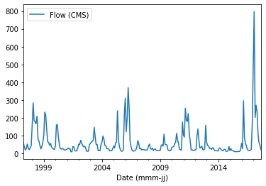
Pandas und Mattplotlib¶
Da pandas funktionalitätswurzeln in der matplotlib-bibliothek darstellen, können diese leicht kombiniert werden, um zum beispiel unterhandlungen zu erstellen.
import matplotlib.pyplot as plt
from matplotlib import cm

flow_ex_df = pd.read_excel('data/example_flow_gauge.xlsx', sheet_name='FlowDuration')

fig, axes = plt.subplots(nrows=1, ncols=2, figsize=(10, 2.5), dpi=150)
flow_ex_df.plot(x="Relative exceedance", y="Flow (CMS)", kind='area', color='DarkBlue', grid=True, title="Blue area plot", ax=axes[0])
flow_ex_df.plot(x="Relative exceedance", y="Flow (CMS)", kind='scatter', color="DarkGreen", title="Green scatter", marker="x", ax=axes[1])
Boxplots und Fehlerbars¶
Ein box-plot] stellt grafisch die Verteilung der (statistischen) Streuung und Parameter einer Datenreihe dar.
Warum ein box-plot mit einem *pandas * datenrahmen verwenden. Der Grund dafür ist, dass wir mit pandas Datenrahmen typischerweise Datenreihen mit pro Spalte statistischen Eigenschaften laden. Wenn wir zum Beispiel ein Steady-Flow-Experiment in einem Hydrauliklabor mit Ultraschallsonden zur Ableitung von Wassertiefen durchführen, beobachten wir Signalschwankungen, obwohl der Fluss konstant war. Indem wir die Signaldaten in einen pandas Datenrahmen laden, können wir einen Kastenplot verwenden, um die durchschnittliche Wassertiefe und das Rauschen bei der Messung zwischen verschiedenen Sonden zu beobachten. So können Sonden mit unerwartetem Rauschen identifiziert und repariert werden. Dieses kleine Beispiel kann in einem größeren Maßstab auf viele andere Sensoren und für viele andere Zwecke angewendet werden (Rauschen bedeutet nicht immer, dass ein Sensor kaputt ist). Eine Box-Plot hat folgende Attribute:
boxes stellen den Interquartilbereich (IQR) dar, der sich vom ersten Quartil (Q1) bis zum dritten Quartil (Q3) erstreckt. Wenn Kerben aktiviert sind, geben sie ein Konfidenzintervall um den Median an.
Mediane sind horizontale Linien, die den Median in jedem Feld markieren.
whiskers sind vertikale Linien, die sich von der Box zu Datenpunkten erstrecken, die durch die angegebene
whis-Regel bestimmt werden.Caps sind kleine horizontale Linien, die die Enden der Schnurrhaare markieren.
Flieger sind Datenpunkte, die über die Schnurrhaare hinausreichen und daher einzeln aufgetragen werden.
Mittel sind optionale Markierungen oder Linien, die die Datensatzmittel anzeigen.
pandas data frames make use of matplotlibdf.boxplot() or df.plot.box(). The following example features box-plots of water depth measurements with ultrasonic probes (sensors 1, 2, 3, and 5) stored in FlowDepth009.csv (download).
us_sensor_df = pd.read_csv("data/FlowDepth009.csv", index_col=0, usecols=[0, 1, 2, 3, 5])
print(us_sensor_df.head(2))
fig, axes = plt.subplots(nrows=1, ncols=2, figsize=(10, 2.5), dpi=150)
fontsize = 8.0
labels = ["S1", "S2", "S3", "S5"]

# make plot props dicts
diamond_fliers = dict(markerfacecolor='thistle', marker='D', markersize=2, linestyle=None)
square_fliers = dict(markerfacecolor='aquamarine', marker='+', markersize=3)
capprops = dict(color='deepskyblue', linestyle='-')
medianprops = {'color': 'purple', 'linewidth': 2}
boxprops = {'color': 'palevioletred', 'linestyle': '-'}
whiskerprops = {'color': 'darkcyan', 'linestyle': ':'}

us_sensor_df = us_sensor_df.rename(columns=dict(zip(list(us_sensor_df.columns), labels)))  # rename for plot conciseness
us_sensor_df.boxplot(fontsize=fontsize, ax=axes[0], tick_labels=labels, widths=0.25, flierprops=diamond_fliers,
                     capprops=capprops, medianprops=medianprops, boxprops=boxprops, whiskerprops=whiskerprops)
us_sensor_df.plot.box(color="tomato", vert=False, title="Hz. box-plot", flierprops=square_fliers,
                      whis=0.75, fontsize=fontsize, meanline=True, showmeans=True, ax=axes[1], tick_labels=labels)
Box-Plots stellen die statistischen Assets von Datensätzen dar, aber Box-Plots können schnell verwirrend (durcheinander) werden, wenn sie in technischen Berichten für mehrere Messreihen dargestellt werden. Dennoch ist es State-of-the-Art und gute Praxis, Unsicherheiten in Datensätzen in wissenschaftlichen und nicht-wissenschaftlichen Publikationen darzustellen, aber etwas einfacher als beispielsweise mit Box-Plots. Zu diesem Zweck können sogenannte Fehlerbars] zu Datenbars hinzugefügt werden. Fehlerleisten zeigen ein gewähltes Unsicherheits- oder Variabilitätsmaß um aufgetragene Werte an und können Linien, Caps und zentrale Marker enthalten. Je nach Messprozess kann Unsicherheit in x, y, beiden Richtungen oder in keiner der beiden Richtungen auftreten. Geben Sie explizit an, ob eine Fehlerleiste eine Standardabweichung, einen Standardfehler, ein Konfidenzintervall, eine Instrumentenpräzision oder eine andere Größe darstellt. Das folgende Beispiel zeigt die Anwendung von Fehlerbalken auf Balkendiagramme der obigen Ultraschallsensordaten.
fig, axes = plt.subplots(nrows=1, ncols=2, figsize=(10, 2.5), dpi=150)
# calculate stats
means = us_sensor_df.mean()
errors = us_sensor_df.std()
# make error bar bar plots
means.plot.bar(yerr=errors, capsize=4, color='palegreen', title="Error bars", width=0.3, fontsize=fontsize, ax=axes[0])
means.plot.barh(xerr=errors, capsize=5, color="lightsteelblue", title="Horizontal error bars", fontsize=fontsize, ax=axes[1])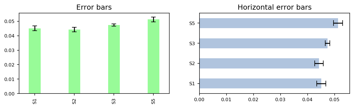
Weitere Optionen zur Visualisierung eines Pandas-Datenrahmens finden Sie unter pandas visualization docs]. Denken sie daran, dass matplotlib immer auf einem pandas-plot angewendet werden kann.
Interaktive Grundstücke mit Grundstück¶
Die oben gezeigten matplotlib- und pandas-pakete eignen sich hervorragend zum erstellen von statischen graphen in einer desktop-, berichts- oder papierumgebung. Obwohl interaktive Plots für Webpräsentationen mit matplotlib erstellt werden können (lesen Sie mehr in matplotlib docs]), nutzt die plotly-Bibliothek viele weitere interaktive Web-Plotting-Optionen innerhalb einer benutzerfreundlichen API. plotly kann auch JSON-ähnliche Daten verarbeiten (die irgendwo im Internet gehostet werden), um Webanwendungen mit Dash zu erstellen. Nur ein Problem: Das Unternehmen dahinter ist handlungsorientiert.
Watch this section as a video
Watch this section on plotly as a video on the @Hydro-Morphodynamics channel on YouTube.
Installation¶
Plotly ist kein Standardpaket, weder in der flusstools Umgebungsdatei (environment.yml) noch in der conda base Umgebung. Daher muss es manuell mit *conda prompt * installiert werden (oder *Conda Navigator *, wenn Sie die Desktop-Version bevorzugen). Die Python Graphing Library von Plotly ist Open Source und unterstützt interaktive, browserbasierte Zahlen sowie statischen Export. Installieren Sie es in der aktiven Notebook-Umgebung mit:
%pip install plotly
Installieren Sie anywidget auch, wenn Sie die Funktionen von Plotly FigureWidget verwenden. Starten Sie den Kernel neu, wenn die Umgebung dies erfordert. Plotly bietet auch separate kommerzielle Produkte an, aber sie sind nicht verpflichtet, die Open-Source-Graphing-Bibliothek zu verwenden.
Lesen Sie mehr über die Installation von Paketen in einem conda environmen oder pip environment.
Nutzung (einfache Grundstücke)¶
plotly wird mit Datensätzen geliefert, die online für Showcases abgefragt werden können. Im folgenden Beispiel wird einer dieser Datensätze verwendet (mehr finden Sie unter plotly.com].
import plotly.express as px
import plotly.graph_objects as go
import plotly.offline as pyo
pyo.init_notebook_mode()
df = px.data.gapminder().query("continent=='Europe'")
fig = px.line(df, x="year", y="pop", color='country')
fig.show()
pyo.iplot(fig, filename='population')
In hydraulics, we often prefer to visualize data in locally stored text files, for example, after processing output from 2d-numerical modeling with NumPy or pandas. plotly works hand-in-hand with pandas and the following example features plotting pandas data frames, build from a csv file, with ploty (better solutions for pandas data frame sorting are shown in the pandas reshaping section). The following example uses plotly.offline to plot data in notebook mode (pyo.init_notebook_mode()) and pyo.iplot() can be used to write plot functions to a locally-living script for interactive plotting (download temperature_change.csv).
import plotly.graph_objects as go
import plotly.offline as pyo
import pandas as pd
pyo.init_notebook_mode()  # activate to create local function script

df = pd.read_csv("data/temperature_change.csv")

country_filter = "France"
month_filter1 = "January"
month_filter2 = "July"

df_country = df[df["Area"] == country_filter]
df_country_month1 = df_country[df_country["Months"] == month_filter1]
df_country_month2 = df_country[df_country["Months"] == month_filter2]

bar_plots = [
  go.Bar(x=df_country_month1["Year"], y=df_country_month1["Value"], name=month_filter1),
  go.Bar(x=df_country_month2["Year"], y=df_country_month2["Value"], name=month_filter2),
]
fig = go.Figure(data=bar_plots)
fig.update_layout(
  title=f"Monthly average surface temperature deviation (ref. 1951–1980) in {country_filter}",
  yaxis_title="Temperature (°C)",
)
fig.show()


# In local IDE use fig.show() - use iplot(fig) to procude local script for running figure functions
# fig.show(filename='basic-line2', include_plotlyjs=False, output_type='div')
pyo.iplot(fig, filename='temperature-evolution')
Interaktive Kartenanwendungen¶
plotly verwendet das GeoJSON]-Datenformat (ein offener Standard für einfache Geoobjekte) in interaktiven Karten. Die Entwickler bieten viele Beispiele in ihrer Dokumentation und der folgende Codeblock repliziert eine Karte, die die Arbeitslosenquoten in den Vereinigten Staaten darstellt. Weitere Beispiele finden Sie unter Website des Entwicklers].
import plotly.offline as pyo
from urllib.request import urlopen
import json
import pandas as pd

pyo.init_notebook_mode()  # only necessary in jupyter
with urlopen('https://raw.githubusercontent.com/plotly/datasets/master/geojson-counties-fips.json') as response:
    counties = json.load(response)


df = pd.read_csv("https://raw.githubusercontent.com/plotly/datasets/master/fips-unemp-16.csv", dtype={"fips": str})

import plotly.express as px

fig = px.choropleth_map(df, geojson=counties, locations='fips', color='unemp',
                           color_continuous_scale="Viridis",
                           range_color=(0, 12),
                           map_style="carto-positron",
                           zoom=2, center = {"lat": 35.0, "lon": -90.0},
                           opacity=0.5,
                           labels={'unemp':'Unemployment rate (%)'}
                          )
fig.update_layout(margin={"r":0,"t":0,"l":0,"b":0})
fig.show()
Viele weitere Karten sind verfügbar - einige von ihnen erfordern ein * Mapbox * -Konto und die Erstellung eines öffentlichen Tokens (lesen Sie mehr unter plotly.com].